
What are UX Metrics, and How Can They Help Your Ad Campaign?
Digital advertising first started out embracing the philosophies of traditional advertising, namely: context and placement matter.
You want that full-page ad in The New York Times. The primetime TV commercial on CBS. Heck, maybe you even want to do a 4-hour takeover on the Sphere.

The rise of programmatic advertising eroded those notions in digital. Digital ad inventory soon became commoditized.
Today, the ability to hyper-target your audience and track “results” means you don’t care where you find your users, as long as you find them.
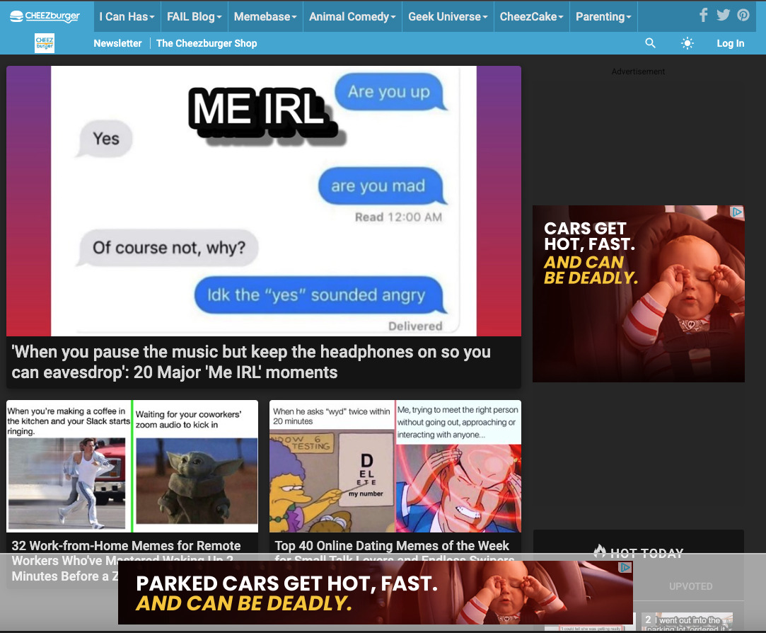
Why pay a $5 CPM on webmd.com? You can drop a pixel on their users and reach the same folks an hour later while they’re scrolling through memes on cheezburger.com. Only now, you’re paying $1 CPM.
Who cares where our ads run?
As long as we get credit for view-through conversions, it doesn’t matter where we serve our ad (or if they even see it).
If we can manage to get an ad on their computer before they complete their purchase, we can say our ad “worked.”
View-through attribution spurred an explosion in ad supply. If I’m cheezburger.com, why wouldn’t I want to add 3 more ad placements to the page?
MFA (Made for Advertising) sites are one extreme version of this practice.
MFA publishers load their pages up with dozens (or hundreds!) of ad slots. Then they get low-quality traffic to their site through some combination of clickbait headlines, paid clicks on sponsored widgets, or even outright fraud.
Many across the industry are taking notice, and revisiting the topic of ad inventory quality.
To block, or to target?
Ad buyers looking to have a say in where their ads run take one of two paths: block lists, or inclusion lists.
Should you run your ads mostly everywhere, blocking only the most egregious offenders?
Or should you exert more control, and run on a focused inclusion list of only vetted and approved sites?
Both of these routes are hard, as they:
- are manual and time-consuming,
- unfairly punish quality long-tail sites by leaving them out by default,
- unfairly reward “well-known” sites that have some of the worst ad experiences out there, and
- are largely subjective.
This is where UX metrics can help.
What are UX metrics?
UX metrics, or User Experience metrics, are data points that describe the user journey on a website. These include:
- The speed at which images and text load on the page.
- The overall responsiveness and fluidity of the site.
- The intensity of data usage and its impact on system performance.
- The number of external requests made to third-party services.
When a website performs poorly in these areas, the negative effects compound for the user.
And if the user is pulling their hair out in frustration, how likely are they to react favorably to a brand’s ad message loading in the middle of all of this?

It’s worth pointing out: UX metrics like website speed have long existed, but only been used by web developers and IT specialists at the websites themselves.
They haven’t yet been used widely by the advertising community, which we think represents a real opportunity.
UX metrics provide an objective way to understand how healthy a site is – for both the user and the advertiser.

So, what exactly does a healthy website look like, and how can this inform our ad strategies?
The Good, The Bad, and The Ugly
We ran a series of browser-based tests for 6 websites (the specific page URLs are linked below).
For our tests, we simulated a user visiting the URL on a Chrome Desktop with a 5 Mbps cable connection.
The results give us insight into how each website performs from a user experience standpoint. Turns out, our results can be neatly bucketed:
The Good: xda-developers.com, stackoverflow.com
The Bad: gizmodo.com, qz.com
The Ugly: billboard.com, psychicmonday.com
Next, we’ll introduce some of the UX metrics we gathered, and walk through the process of what a user encounters as a page goes through its loading process.

One tidbit to call out: psychicmonday.com meets the criteria for “MFA Site” classification.
1. Render
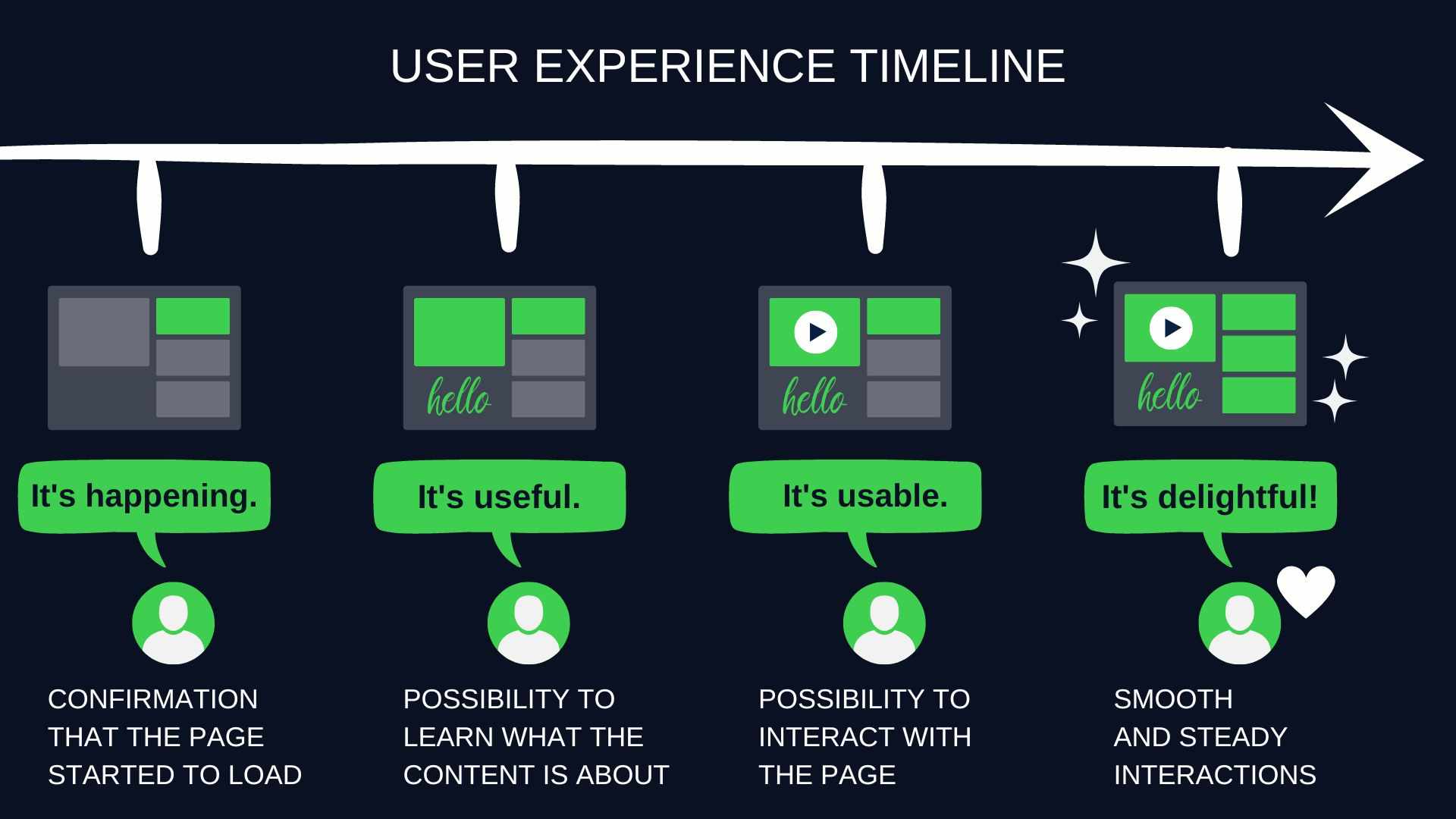
Render is a good first metric to look at because it marks the time when the user starts seeing something appear on the screen.
It could be text, it could be an image, it could even be the website’s background color. The menu bar is a popular choice for what to load first:
The user now has a preliminary indication that this site is working, and to hold tight, the content is coming.
Now, when looking at UX metrics, you would generally expect The Good sites to do the best, The Bad sites to do a little worse, and The Ugly sites to perform terribly.
This is the case for most metrics, but Render is a notable exception.
Why?
Let’s take one of the biggest UX offenders: MFA sites.
MFA publishers know that:
- users have some preconceived concerns. Will clicking on this Taboola widget take me to the content that was promised?
- users will get hammered with a poor UX later, so these MFA publishers want to make a good first impression with a low Render time.
Their plan: load some initial content ASAP. Give the user positive feedback that they’re about to find out which quarterback has the most expensive home in NFL history.
And once you have them feeling comfortable, then you can blast them with ad calls and cookie syncs.

A Render time of less than 0.4 seconds is excellent. You want your audience to get immediate feedback that the site is working. Anything over 1.1 seconds is poor.
As promised, the sites in our test did fairly well:
The Good
- xda-developers.com: 1 second
- stackoverflow.com: 1.1 seconds
The Bad
- gizmodo.com: 0.3 seconds
- qz.com: 0.7 seconds
The Ugly
- billboard.com: 1 second
- psychicmonday.com: 0.6 seconds
But it’s about to get worse. In some cases, a lot worse.
2. Visually Complete – 85%
You can probably guess what this one is: the time at which 85% of the page’s content is visible to the user on-screen.
Note that this is for “above-the-fold” content only, so it does not include all the content that requires you to scroll down to see it.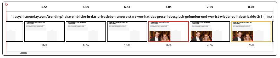
While 85% of the visible content above the fold has appeared on screen, there could still be a ton of things that need to happen on this site.
This could be front-end stuff: below-the-fold content that requires scrolling to get through.
Or it could be back-end stuff: behind-the-scenes code that still needs to run and process. We’ll get into this shortly.
It is at this 85% point that The Bad and The Ugly websites begin to show their true colors.
Anything under 1.5 seconds is excellent. Anything over 12 seconds is abysmal.
The Good
- xda-developers.com: 1.4s
- stackoverflow.com: 1.2s
The Bad
- gizmodo.com: 13.5s
- qz.com: 0.7s
The Ugly
- billboard.com: 37.0s 👀
- psychicmonday.com: 15.2s
Now we’re falling more into line, although we see qz.com is still faring well. Spoiler alert: that’s about to change.
3. Visually Complete – 100%
Ok, again, this doesn’t mean the site is done doing everything. But it looks complete to the user (again, above the fold only).
Images are in place, menus and links have appeared, and the text is there. The user is well on their way.
Anything under 2.2 seconds is excellent. If it takes 5 to 9 seconds for the page to appear visually complete, that is the middle of the road. Greater than 9 seconds is poor, greater than 18 seconds is abysmal.
The Good
- xda-developers.com: 1.4s
- stackoverflow.com: 3.8s
The Bad
- gizmodo.com: 13.5s
- qz.com: 30.0s
The Ugly
- billboard.com: 119.0s
- psychicmonday.com: 26.1s
It’s not surprising to see our MFA site, psychicmonday.com, clocking in with an abysmal time of 26 seconds.
But Billboard.com at 119 seconds is beyond abysmal. I wasn’t quite sure what word to even use to express something beyond abysmal. Catastrophic felt a little too heavy, so I asked ChatGPT for some help: 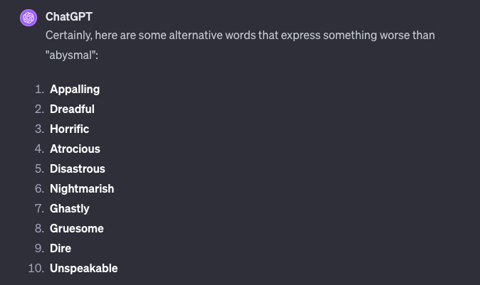
Feel free to fill in the blank with your favorite option.
4. Fully Loaded
Our page is visually complete already. But, as we mentioned, there is still all of that below-the-fold content and behind-the-scenes activity to consider.
Should be minor, right? Gotta tie up a few loose ends, and possibly complete a task or two. After all, the user can see 100% of their content, what else needs to happen?
For the best sites, not too much. They load the rest of the below-the-fold article and images, finish up a few scripts, and are done. But for the worst sites, you see some shocking Fully Loaded times.
Anything less than 5 seconds is excellent. More than 35 seconds to fully load is atrocious.
The Good
- xda-developers.com: 6.9s
- stackoverflow.com: 6.7s
The Bad
- gizmodo.com: 106.7s
- qz.com: 83.1s
The Ugly
- billboard.com: 120.7s
- psychicmonday.com: 101.4s
The Good sites are the clear outperformers here.
The Bad and The Ugly sites all clock in at 80+ seconds, more than double our benchmark for “atrocious.”
That means a lot of time is spent on behind-the-scenes site activity.
What are these “behind-the-scenes things” we keep alluding to?
Ads. Definitely ads.
Ok, not definitely. It can be additional things, like CSS layouts, fonts, and third-party widgets.
But it’s predominantly ads and ad-related activity. JavaScript requests still processing and rendering. Tracking scripts for analytics. User behavior tracking and cookie syncing. Auto-play video ads downloading in delayed chunks.
And some sites, especially our most ad-heavy ones, aren’t even done at the Fully Loaded time. Ad refreshes, lazy loading, delayed or asynchronous JavaScript calls, measurement pings, and more.
5. CPU Percentage
Not all 2 minutes are created equal.
If a website takes 2 minutes to load, it can be a chill 2 minutes, or it can be an incredibly demanding 2 minutes for your device.

CPU Percentage tells us how much of your device’s processing power the site hogged.
Less than 17% is excellent. More than 40% is asking a lot of your device. This will be especially obvious if the fully loaded time for the site is also a long one.
The Good
- xda-developers.com: 22%
- stackoverflow.com: 31%
The Bad
- gizmodo.com: 25%
- qz.com: 31%
The Ugly
- billboard.com: 40%
- psychicmonday.com: 63%
A site eating up 63% of your device’s CPU for 101 seconds? Hope you didn’t plan to multi-task and get something else done while you wait for it to finish.
Unfortunately, when you click on one of these clickbaity headlines, you probably have a few other tabs also open on your browser, along with maybe an app (or 10) running.
This is when you open Task Manager and begin shutting things down on your computer.
If users happen to see an advertiser’s ads on one of these pages, how do you think they feel about a brand contributing to this mess?
We don’t want our ads showing up in negative contextual environments, so why do we show them in poor user experience environments?

6. Time to Interactive (TTI)
Ok, we’ve covered the website loading process from start to finish.
To review:
- Render is the point at which users start to see content.
- Fully Loaded means *most* things are done happening.
Somewhere in the middle between render and fully loaded, the user may want to take an action, such as clicking on a link.
However, there usually is a delay until the site can register the user’s action. This is Time to Interactive.
Before this point officially occurs, things like article links or menu links either:
- aren’t yet visible,
- ARE visible, but there is still so much loading you can’t successfully move your mouse to the link, or
- aren’t yet clickable.
At the Time to Interactive point, it can finally register your click.
This milestone is important for users, especially for those hoping for a quick interaction.
A prime example is visiting a news homepage. If your goal is to click on an article, any time stuck waiting is seen as time wasted.
A Time to Interactive of less than 2 seconds is excellent. 4 to 7 seconds is okay, and greater than 14.6 seconds can severely frustrate users.
The Good
- xda-developers.com: 2.6s
- stackoverflow.com: 3.3s
The Bad
- gizmodo.com: 50.4s
- qz.com: 66.0s
The Ugly
- billboard.com: 77.9s
- psychicmonday.com: 104.9s
Why don’t sites do their best to make their content immediately interactive? Let’s discuss the biggest reason next.
7. Total Blocking Time (TBT)
Any item on a webpage can load asynchronously, or it can load synchronously. This applies to images, ads, forms, or anything else on a page.
If the item is set to load asynchronously, great. This means it can run whenever, and it can run in parallel while other things are running.
On the other hand, if an image or an ad is set to run synchronously, it blocks everything else from happening while it’s doing its thing.
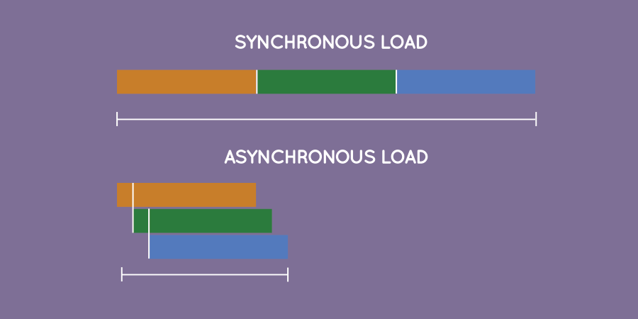
All these tiny little blocks add up to give the website its Total Blocking Time. You want to keep Total Blocking Time to a minimum.
An excellent Total Blocking Time is anything less than 0.1 seconds. 0.4 seconds marks the middle of the road, and more than 1.2 seconds is unacceptable for users.
The Good
- xda-developers.com: 0.02s
- stackoverflow.com: 0.2s
The Bad
- gizmodo.com: 4.5s
- qz.com: 2.1s
The Ugly
- billboard.com: 6.6s
- psychicmonday.com: 5.1s
It’s during these moments when things appear most stuck for users. This can result in them trying to do other things, like clicking around or “cursor thrashing.” Hopefully, this doesn’t lead to accidental clicks for your ad!
Cursor thrashing at its finest.
8. Requests
To fully load a website, multiple components are required. These include the site’s HTML document, which forms the backbone of the page; CSS sheets, which instruct the browser on the visual elements like colors, fonts, and layout; and various content images that enhance the site’s appearance.
Each of these elements is retrieved through external Requests.
How does it work? The browser sends a Request to fetch each specific component necessary for constructing and displaying the webpage to the user.

And, you guessed it: Requests can also be for ads. Many, many Requests can be for ads.
One ad could mean one Request. But realistically, one ad requires multiple Requests. And in our worst-case scenarios, one ad could require dozens and dozens of Requests.
These could be for the ad call itself: send a Request to the ad server, send Requests to alllll the SSPs, and send Requests to alllll the DSPs. It could also be for measurement, attribution, behavioral pixels, and cookie syncing.
For The Ugly sites, these Request numbers can be staggering.
An excellent number of Requests is fewer than 25. 50-150 requests, while a lot, is not that uncommon. More than 300 is insane. (You could certainly argue for an even lower standard for sanity).
The Good
- xda-developers.com: 55
- stackoverflow.com: 64
The Bad
- gizmodo.com: 1,329
- qz.com: 1,436
The Ugly
- billboard.com: 2,110
- psychicmonday.com: 2,447
Of course, the MFA site “wins” the trophy for sending out the most external Requests.
But our well-known names billboard.com and gizmodo.com aren’t too far behind, and they are NOT classified as MFA sites. Unfortunately, these sites get a free pass in MFA-focused approaches.
9. Data Burden
Each Request results in data being transferred, downloaded, and processed. Data also gets sent out externally.
The data coming in includes everything needed to display the webpage to the user – HTML, CSS, and JavaScript.
In many cases, JavaScript accounts for 50%+ of this equation.
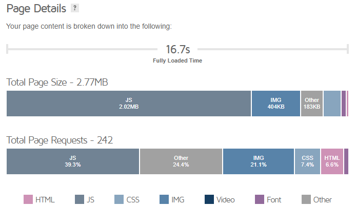
JavaScript is used for a ton of stuff, from UI elements on a page like dropdowns and sliders, to animations and visual effects. But of course, most commonly: ads.
The amount of data transacted and processed can be a heavy burden on the page, and the user’s experience. There are also knock-on effects, such as mobile data usage and energy consumption.
Ideally, you want the Data Burden to be under 1.9MB. More than 18MB is awful.
The Good
- xda-developers.com: 2.9MB
- stackoverflow.com: 3.8MB
The Bad
- gizmodo.com: 20.2MB
- qz.com: 16.9MB
The Ugly
- billboard.com: 42.9MB
- psychicmonday.com: 23.2MB
We see The Bad and The Ugly clocking in as data hogs. This of course means your experience is getting bogged down.
But it also means a heavy ad load, lots of pixels firing, and behavioral data sent externally.
UX Metrics and Inventory Curation
As we touched on earlier, the primary methods of inventory curation are using either block lists or inclusion lists.
Block lists have some merit. Just as you can block the most brand-unsafe sites, you can also find and block the worst UX sites.
The main drawback of the block list approach applies here too though: for every bad site you block, two more pop up in its place.

This is why we advocate for the inclusion list approach. But where to start?
A simple inclusion list of the “Top 1000” websites is easy enough to grab, but:
- you’ll just be running where everyone else is running
- you’ll miss out on great long-tail websites that have built up niche passion audiences, and
- as we’ve covered today, even the “Top 1000” type sites can have distracting and noisy ad experiences that aren’t the most effective use of your ad dollars.
Going Beyond the Top 1000
If you want to support the open web and reach your audience outside of the “Top 1000,” navigating the vast sea of long-tail sites is a daunting task.
Not only is there an overwhelming number of sites to review, but you really have to dig in, as the ad experience can vary widely even within the same site.
The homepage of a site often puts the site’s best foot forward, so it can be misleading. It’s brand-safe, loads quickly, and has just a few ads mixed in.

When you go deeper into the site, visiting a few of its links, you start to get a better read on the site’s ad environment.
And even then, some pages have more ads than others. For MFA sites, their real cash cows are the articles they don’t even link anywhere else on their site. You can only find these by clicking on one of their paid traffic placements.
UX metrics provide objective criteria to weed out bad inventory at scale.
Running your inventory mix through the UX metric gauntlet puts all websites on equal footing, whether they have the prestigious designation of “Top 1000” or not.
Is the website fast and enjoyable for users?
Slow load times, frustrating navigation, and an overload of JavaScript and external requests make it challenging to connect positively with users through your ads.
How to Put UX Metrics into Action
If you’re curious about what the user experience looks like on your ad campaign today, the easiest starting point is simply using the eye test.
Look at your delivery report and pick a few of your top sites. Visit those sites, and click on a few articles. Take note of how long it takes for content to initially appear on your screen, and how long before it’s all on screen.
- How far down does the page scroll?
- Is the content taking an exceptionally long time to load?
- Are the ads frequently refreshing?
- Is scrolling slow and janky?
- Have you heard the fan on your computer kick on yet?
- How many of the ad slots are blank, or very slow to load?

For those looking to go a little deeper, there are publicly available tools such as KeyCDN Website Speed Test that give you a handful of useful UX metrics like load time and requests.
You can also use Google Chrome DevTools to check the responsiveness of webpages under various network conditions and speeds. It’s particularly useful for identifying how different webpage elements load, but it can also be a bit overwhelming to wade through.
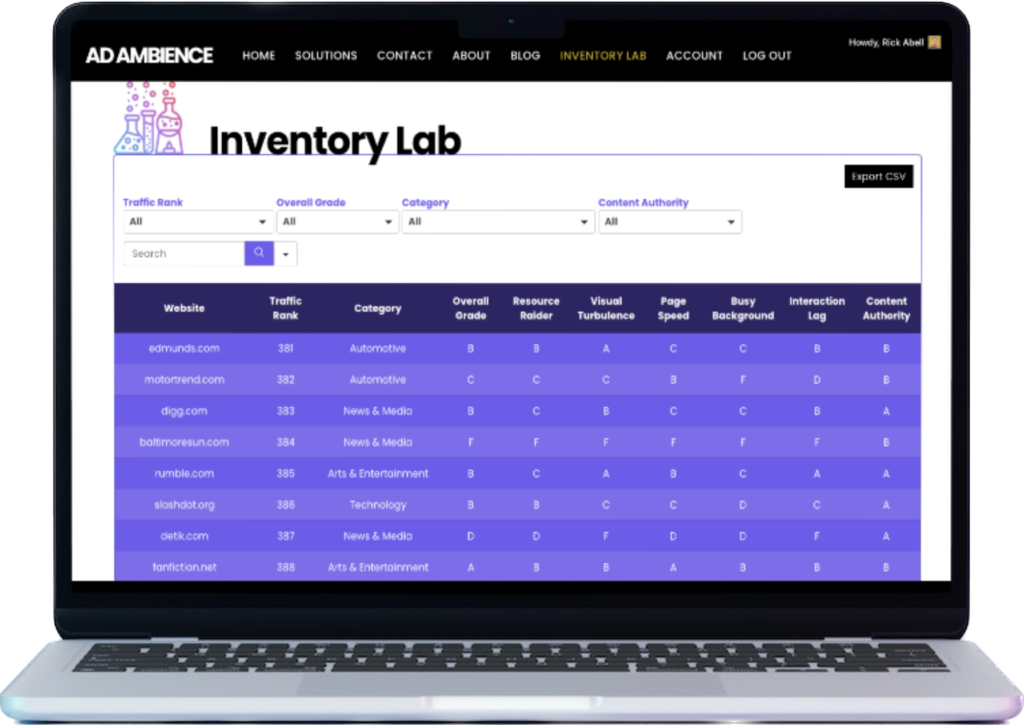
Or, of course, if you’re looking for some help to implement this at scale across your programmatic buying strategy, we’re here to help too. Our Inventory Lab planning tool can help you craft a customized media plan to deliver the user experience that’s right for your audience.
We can also provide a free assessment of the user’s experience on your current ad inventory mix and work with you to test inventory curation options.
Wrap-Up
You can have the best ad creative in the world, but if it’s jammed next to 5 other ads on a laggy, frustrating website, it’s not going look quite as shiny.
There’s a reason the Mona Lisa is hanging in the Louvre instead of in the back of an old, dingy gas station next to the day-old hot dogs and broken slushy machine.
It’s not just about maximizing audience reach. How and where you reach them is an important part of connecting with your audience as well.
Footnotes
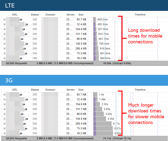
- These tests were performed with a series of browser-based tests, simulating activity across these websites on a Chrome Desktop and a 5 Mbps cable connection from a Virginia, US location.
- We encourage you to run your own tests (and share the results with what you’re seeing!). But it is worth mentioning that results will vary based on device, browser, internet connection, time of day, location, and cookie profile. Results can also vary even if you hold all these factors constant.
- UX metrics tend to be more favorable when you are visiting the site for the 2nd+ time (including page refreshes). You can test this difference for yourself, but keep this in mind for subsequent tests
- Results are URL-dependent, fluctuating even within the same site. This is especially true for MFA sites. The homepage, and main articles linked from the homepage, perform considerably better than their clickbait articles stuffed with ads.
- Often, clickbait articles can’t be reached anywhere from the site itself (not from the menu nor any side or footer menus).
- The URL may also contain specialized triggers, requiring a series of specific UTM parameters to be present to deploy maximum ad stuffing and degraded user experience.
- Lastly, these sites can change at any time. We certainly welcome any of our discussed sites taking note and making UX improvements. Often with MFA sites, once they’ve been uncovered, they change the ad experience on the URL(s) in question. In some cases, they shutter the URL and transfer the content to another domain.
