
What is CLS
(Cumulative Layout Shift)?
What’s the most annoying thing you run into on the web today?
I can tell you mine, and it actually has a name: CLS.

CLS stands for Cumulative Layout Shift, which while a mouthful, is a fair description of what’s happening. Let’s break it down.
You’re on a site, reading an article, and there’s a link that intrigues you.
You hover your cursor over the link, and just as you press *click*, boom, it happens.
All of the content on the web page suddenly shifts down, and you see your cursor is somehow now hovering over an ad.
But it’s too late. The click registered on the ad, and off you go to the advertiser’s page, leaving you asking, “WHYYYYYYYYY???”
A screencast illustrating how layout instability can negatively affect users.
Why is this happening? Cumulative Layout Shift.
What is Cumulative Layout Shift (CLS)?
Cumulative Layout Shift (CLS) is a measure of how stable a web page is as it loads (aka “visual stability”).
If elements on a page are shifting up or down as the page loads, then the page will have a high CLS. This can make for a jerky, disruptive experience for the user.
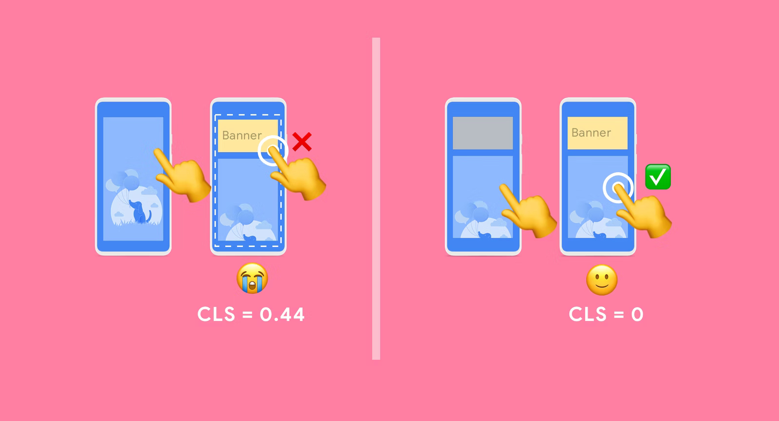
At best, the user is inconvenienced, and at worst, they end up clicking on an ad unintentionally.
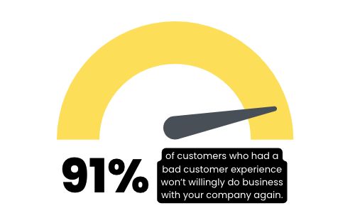
RIP to the advertiser as well, as it takes 12 positive customer experiences to make up for one negative experience. Or for another way to look at it:
It’s great to see user-centric metrics like CLS getting increased attention these days.
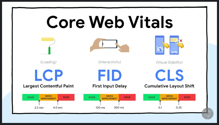
In fact, CLS is one of the three metrics that make up Google’s “Core Web Vitals.” These are worth a quick detour:
What are the Core Web Vitals?
The Core Web Vitals is a set of three user-centric metrics that help us understand how healthy the “user experience” is on a given website.
Google first introduced this concept of the Core Web Vitals on May 28, 2020.
The goal? To help publishers measure and improve the speed and user-friendliness of their websites.
The Core Web Vitals help us answer three questions about a website:
1. Is the site working?
The first of the 3 Core Web Vitals, Largest Contentful Paint (LCP), gives us a measure of how fast a site loads.
Namely, how many seconds does it take for the largest sized element (typically a large image) to appear to the user?
2. Is it ready?
First Input Delay (FID) measures site interactivity. When you click on a link on the page, how long does it take for the site to respond?
3. Can I use it?
And finally, Cumulative Layout Shift (CLS) tells us if it’s safe to use the site, or if we might get blindsided by the page shifting around while we’re using it.
Ok, so the Core Web Vitals give us one snapshot of how user-friendly a website is.
And coming back to the star of our post, Cumulative Layout Shift, it does sound pretty annoying.
So then you might ask…
Why does Cumulative Layout Shift happen?
First, the good news: it’s quite preventable.
CLS happens purely because of the publisher’s web design.
It is never an intentional feature on the publisher’s part, but rather a consequence that can be mitigated.
We won’t get too deep in the weeds here, but high-level: it’s because the publisher didn’t properly define how much space an element on the page needs.
You see this happen most often with visual elements like images.
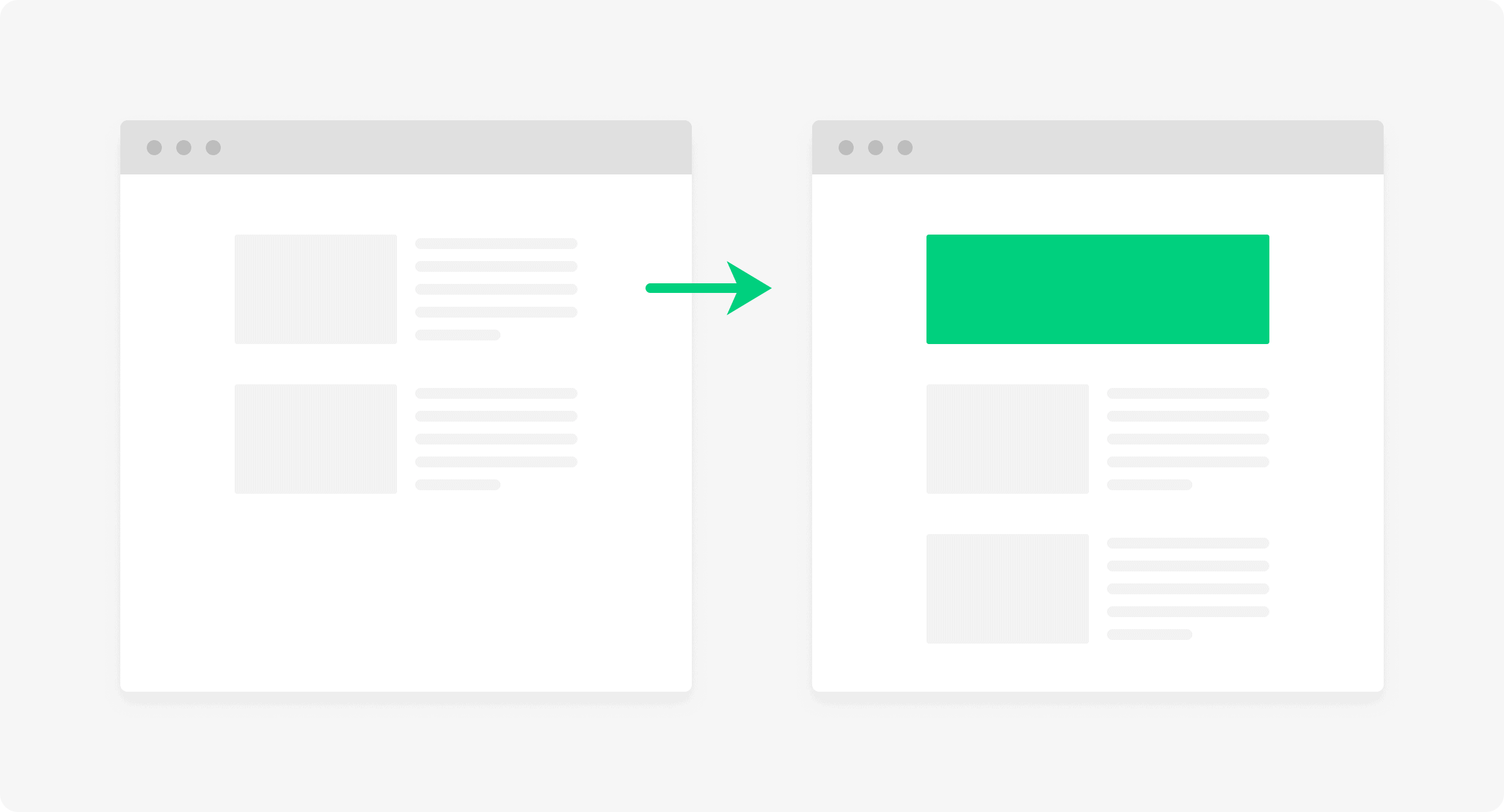
Because text is easy and light to load, this is usually the first thing you see show up on a page.
Then the images start popping in. Now, if the publisher defined the width and height of the image ahead of time, great, we have no Cumulative Layout Shift.
(Click play to see the video example):
This publisher is observing image best practices.
But if they didn’t define the image dimensions, the browser is left to guess, and that’s when you get this:
Publisher did not observe image best practices.
Oof, don’t love when that happens. Right when the article is getting good, all the content gets pushed down and you need to readjust your eyes.
But since the publisher knows how big the image should be, they should be able to define it ahead of time and avoid this, right? Yep.
Where It Gets A Little Trickier: Ads
Ads are one of the largest contributors to layout shifts on the web.
Why?
The most common reason: multi-size ad tags.
This won’t come as a surprise to many, but larger ad sizes tend to pay publishers more money. Naturally then, publishers will look to run larger ad sizes on their site.
The challenge? There often isn’t as much advertiser demand for these larger placements.
This means publishers cannot fill 100% of their available inventory solely with the larger, higher CPM ads.
Publishers look to get the best of both worlds by running multi-size ads.
Instead of running a 970×250 large banner tag at the top of their site, they run a 970×250/728×90 multi-size ad.
If there is a bid for the larger, higher CPM 970×250 ad size, great! Fill it. If not, the ad tag will accept bids for 728×90 ads.
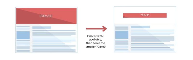
Ads with the 728×90 size are more commonly used by advertisers, helping the publisher to maximize fill rate.
Sounds good, what’s the problem?
The publisher doesn’t know if the ad will take up 970×250 worth of space on their site, or only 728×90.
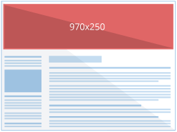
The solution: the publisher should reserve the largest space possible.
In our example, the publisher needs to design the layout to accommodate a 970×250 ad.
If only a 728×90 serves, yes, there will be some additional whitespace, but this is better than the alternative: jerky content shifts and a poor CLS score.
If the publisher only reserves space for the smaller ad size (or worse, reserves no space at all!), you could get this:
Ads without sufficient space reserved.
Reserving for the larger ad space lets everything else load where it’s supposed to:
Ads with sufficient space reserved.
Got It. High CLS = Bad. Now What?
Both publishers and advertisers stand to benefit from prioritizing user-centric metrics such as CLS.
For Publishers:
There are two great reasons to take a closer look at improving your CLS.
1. Your users will appreciate the improved user experience.
2. There is a tangible revenue benefit as well. When publisher iCook improved their CLS by 15%, they saw a 10% increase in ad revenue as a result.
You can grab your Core Web Vitals scores including your CLS from a variety of sources.
It’s recommended to use a combination of data from field tools like your Google Search Console and lab tools like Chrome DevTools to give you a balanced view.
For Advertisers:
A good starting point is incorporating user experience metrics into your media planning and measurement.
Thanks to the halo effect, users enjoying their time on a website are more likely to transfer positive associations to the brands advertising there. Running ads in poor CLS environments can lead to unfavorable brand experiences.
Not sure where to start with user experience metrics? Give us a holler.
Conclusion
Cumulative Layout Shift (CLS) is one user-centric metric that helps us gauge how smooth and enjoyable your experience will be on a given website.
Just remember: if the content jumps, the CLS score pumps. And that’s bad.
How about you, what’s your most frustrating feature you run into on the web today?
And how do you react – do you close the browser tab or power through it? Let us know in the comments below.
